DIY Headboard: Fabric Designing
Designing the fabric for this headboard was probably the most time consuming part of the whole project. I loved florals but didnt want it to be to girly. I loved geometrics but wanted the design to have movement. The room is pretty small. Our queen sized bed takes up almost half and to get to my side of the bed you have about a foot of space between the corner of the mattress and the radiator box. It doesnt feel overly small and Cam and I are more living room people then bedroom so we really only sleep and get dressed in there. I figured since the bed was already taking up so much room I might as well make it a statement as soon as you walk in. Our ceilings are the average 7.5 to 8 ft tall (we have an old house so nothing is the same) I do have to think about being able to move this headboard from my office/work room into the bedroom and when we eventually move it needs to fit out of the door.
Im a visual person so I used AI to help me see what colors and designs would look best in our room given the amount of sunlight that room gets. I played around with a few rough designs I threw together in photoshop just to help get the idea. In the end I felt more excitement for the floral designs then that geometric. I did not like the victorian, soft, girly flowers. The spiked Georgian style was more what I wanted but with breezing room throughout the pattern so your eye could rest as it moved across the headboard.
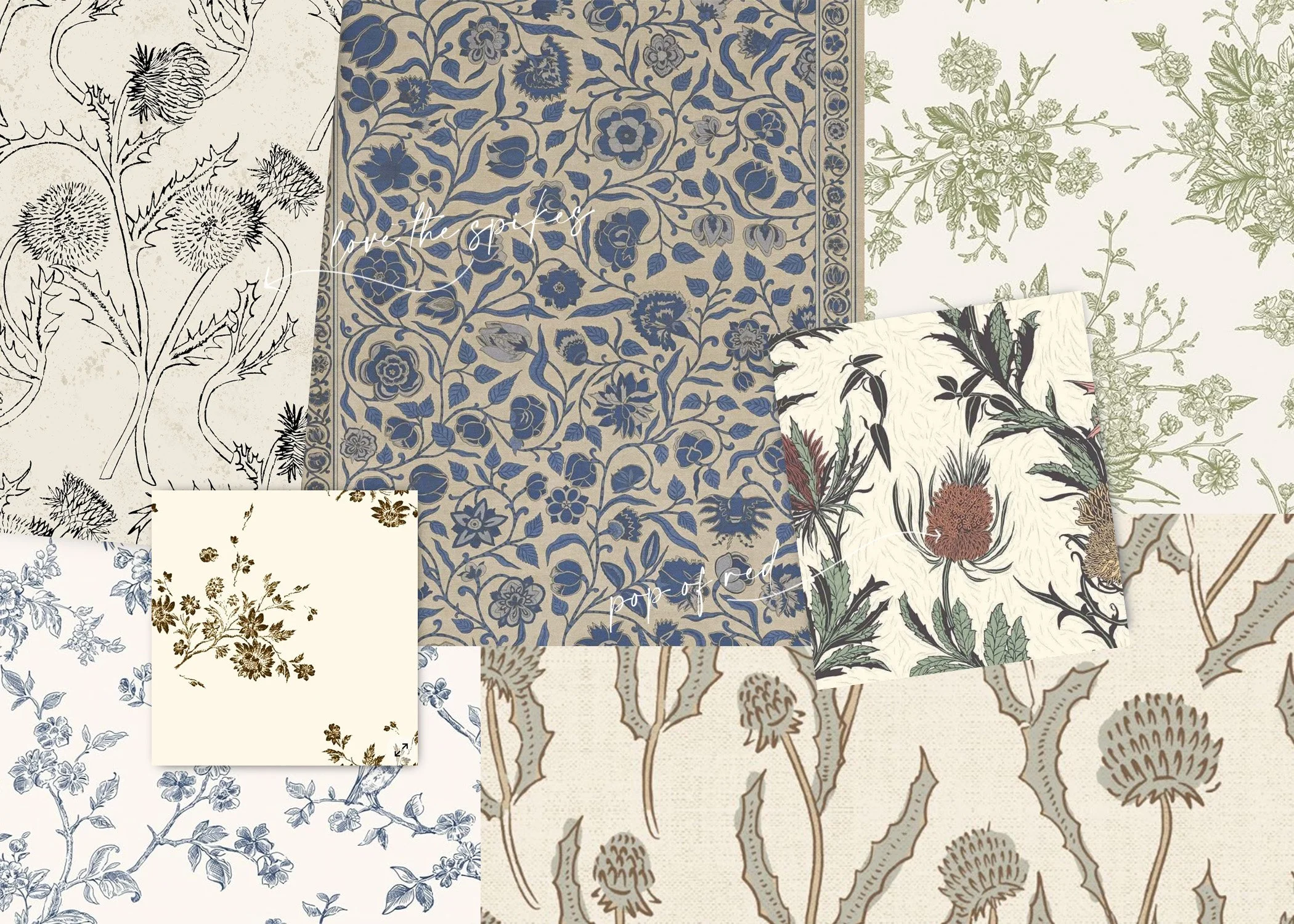
Color placement and color combinations are sometimes tricky especially when you are starting from scratch. I have a few color palettes saved that I can browse through and try randomly placing but for this one I wanted a historic feeling to the design and color. I pulled a few historical books and looked at historical textiles and wallpapers online to get some ideas. While using AI to mock up the look this headboard should have in our room I really liked the how the green and blue backgrounds looked. Once the design was made into a repeat and sized to look proportionate with the width and height of the headboard I ordered the design in a soft vintage green and three different dark blue colors.
Having the physical printed fabric makes all the difference. How a blue looks in one room of your home is not how it will look in a room on the other side of the house. Our place is surrounded by trees and also has a red painted house next door. Those colors bounce off onto our walls and furniture everyday. I taped all four of the sample fabrics to the area the headboard would be placed. The thing with color is even though I color matched it on screen in person every color was slightly off to the paint chip I had. Printed fabric will change slightly in color and darker colors has a tendency to stripe when printed. Striping is a break in the printer creating visible lines where their should be solid color.
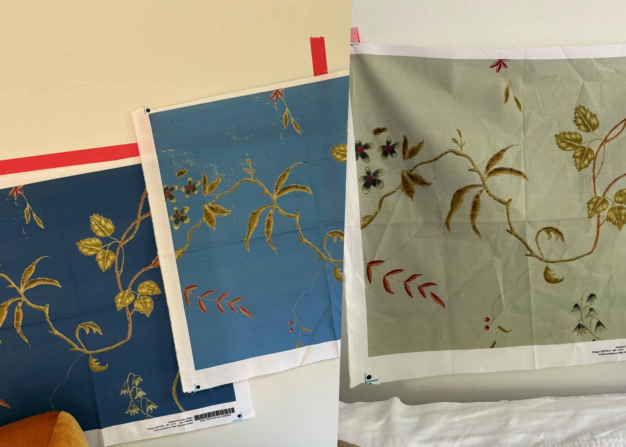
I kept the fabric samples up for over a week. I wanted to see these in every type of lighting the room gets and even different types of weather. On sunny days the green from the surrounding trees over powered the green backgrounded style while when the red of our neighbors house reflected into our room one of the three blues turned almost purple. I like living in a space and when Im planning to build something or in this case upholster something for a space I like to take my time and live with the samples of my ideas for around a week or more. In the end the pattern I color matched to Benjamin Moores NY State of Mind won not only for me but for Cam as well. It was the perfect blue for the room. After doing some math I ordered two yards of the fabric to cover the main headboard and the two wings.